My name is Leo, and I was born and raised in Innsbruck. The breathtaking scenery of this city sparked my passion for photography from a very young age. My love for capturing images eventually led me to the Medienkolleg in Innsbruck, where I deepened my knowledge of photography, camera technology, and filmmaking. It was during this time that I first encountered graphic design, and I immediately fell in love with it. Since then, my fascination with design has only continued to grow, fueling my creativity and inspiring me to explore new visual possibilities.
As a graphic designer, I serve as the bridge between strategy and communication, ensuring that ideas are conveyed effectively to the world. In my work, I strive to find the perfect balance between these two aspects of design while making products visually appealing and engaging for the audience. When I’m faced with a task or problem, I can't stop thinking about it—often from a highly creative perspective. This creative problem-solving mindset allows me to consistently find solutions, no matter how challenging the task may be.
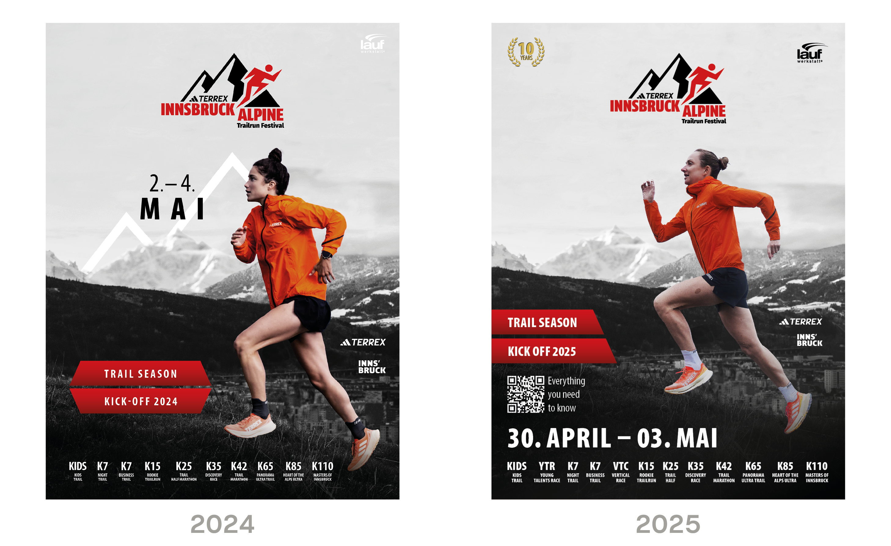
The posters from previous Innsbruck Alpine Trailrun Festivals lacked vibrancy and impact, as they primarily used black-and-white designs. The problem with such dark and muted colors is that they often fail to catch the viewer’s attention—especially when the goal is to inspire people to participate in the event. To address this issue, I took a straightforward but effective approach. During the planning of a photoshoot with Adidas, I specifically requested that the models wear bright orange jackets. These vibrant photos became the foundation for this year’s corporate design, replacing the monochromatic look with eye-catching colors. The orange jackets served as a focal point, drawing attention and making the posters far more noticeable. Building on the success of the 2024 design, which was very well received, I decided to make only subtle refinements this year. By consolidating the information at the bottom of the poster, I achieved a cleaner, more uniform look while retaining the visual impact of the design.
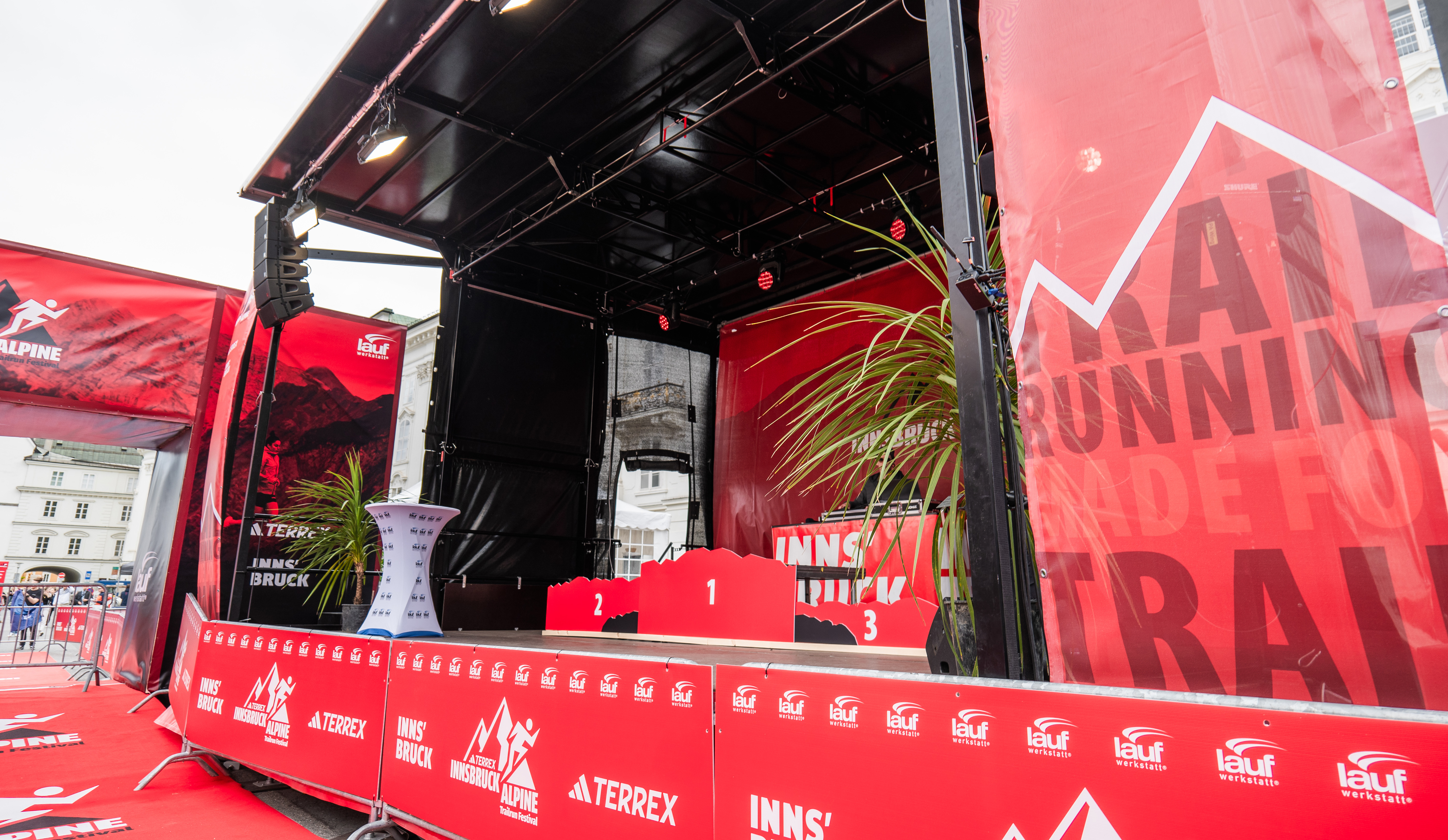
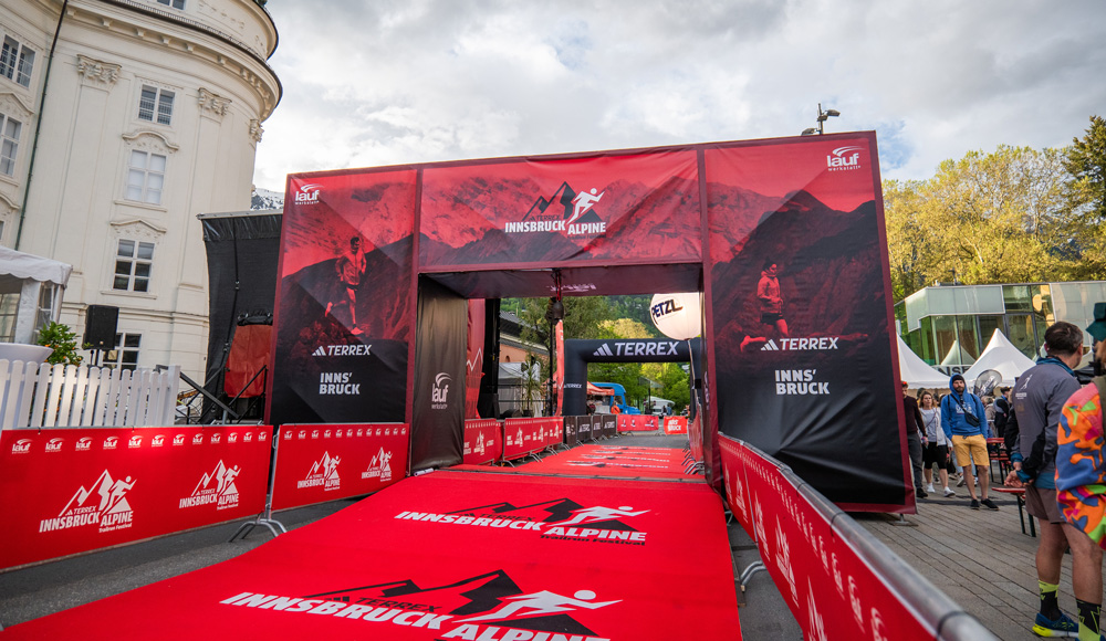
I utilized the posters and photos from the photoshoot to design all print and marketing materials for the Innsbruck Alpine Trailrun Festival. This included a cohesive visual identity across various media, ensuring the festival’s branding was both consistent and impactful.
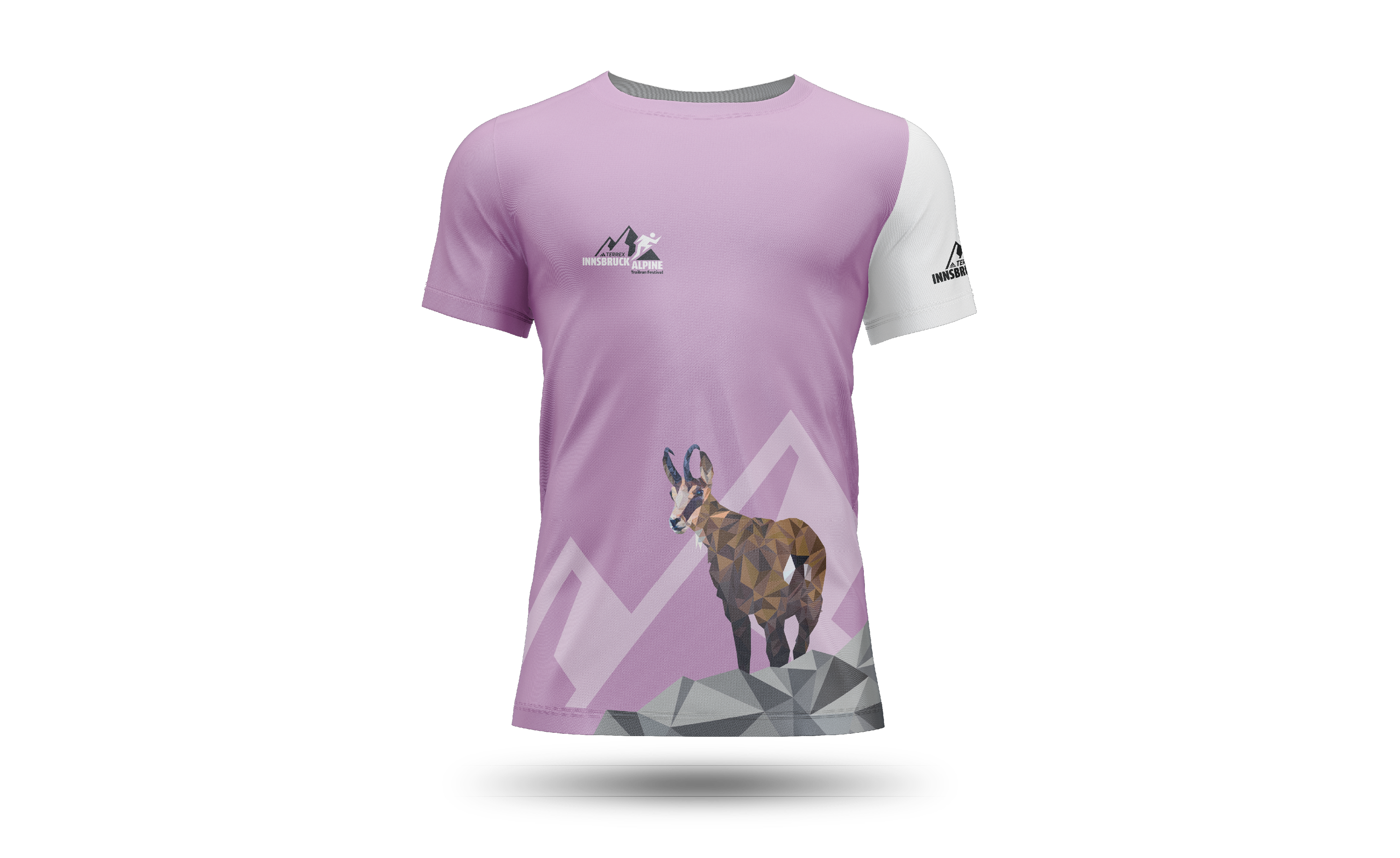
Every year, participants of the Innsbruck Alpine Trailrun Festival have the option to purchase a shirt when signing up for one of the races. The shirt is part of the "Austrian Wildlife Series," which features a different alpine animal each year, depicted in a polygonal art style. This year, I had the opportunity to design the shirt. Since the chamois is a symbol of the Alps, I chose it as the central motif for the design.
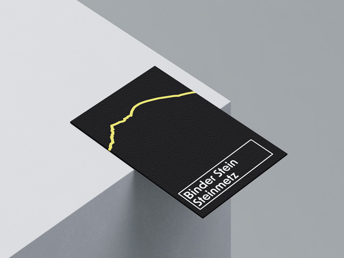
The original business cards didn’t have any major issues—the owner had been using them since he opened his business in 2007. However, the goal was to modernize the design and make the cards more memorable. To create a design that captured the essence of the stonemasonry craft while referencing the business's location, I incorporated the silhouette of the mountain range where the business is located, alongside the company name. This approach combined the local identity with a subtle nod to the stonemasonry profession, represented by the mountain imagery, creating a strong connection between the business and its geographical context.
Capturing the beauty and strangeness of the world has always been my goal whenever I pick up my camera. Both beauty and strangeness are subjective, which gives my approach to photography a unique and unconventional edge—exactly how I like it. This perspective allows me to see and understand the world from a fresh and intriguing angle.